Over the past couple of years, the advent of responsive web design has changed the way we think about websites. We no longer need to feel compelled to plan around countless devices. Rather, we can plan for a single web experience that works in unpredictable contexts.
More often than not, that comes down to the content. Responsive web design, within the larger school of thought around creating adaptive content, gives content folks a lot to think about in that regard. How is content structured? How is content written? What is our content hierarchy? How does content reflow on the page? In short, a responsive web design is an exercise in decision-making around content.
As we know, many higher education institutions have been quick to implement responsive web designs, embracing the benefits and accepting the challenges inherent therein. We reached out to some of the staffers behind recent responsive redesigns and asked them about how content planning factored into their projects.
The answers varied, but there was a common theme: if you’re not thinking about your content when planning a responsive web design, you can’t succeed.
(On June 19, we delivered a Meet Content webinar on content planning for responsive web designs. Check out the slides and Storify from the session.)
Wright State University
Mark Anderson, Senior Web Administrator:
As we were originally planning the build of our new site last summer we developed a set of design principles. One of these core principles was to make sure that all new websites we produced were “device agnostic”. Responsive design was our main method of achieving this goal. Since we have had this early goal it has helped our whole team to think about how content will be altered for different display sizes.

Many content layout decisions have been driven by our early development of templates that have been designed and themed. We try to make conscious decisions about which content should exist in the body vs. sidebars, with an understanding that on the smallest layouts the sidebar content will be lower on the page than on a larger screened device. As part of our Drupal builds we are making some content that is being produced through queries (Drupal views, etc.), so sometimes responsive decisions happen during development alongside content planning.
There are many things we want to do to make content more consistent across all devices that we will be working to implement this summer, such as responsive images. In some cases we are hiding content completely on smaller devices due to a lack of a good way to scale it currently.
I would say one of the largest shortcomings we have with responsive design is that we do not work with it daily until well into the build out phase of the content and theming. Since we all work on large-screened devices all day it is very easy to neglect the other layouts. Something like Adobe Shadow could help with this to a large extent but we have not worked with it yet.
Jessica Sparks, Web Designer:
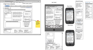
I think we all had a pivotal moment (especially me as the “content sheriff”), when we created side-by-side wirefames of the desktop, tablet, and mobile together. I have attached an example so you can see how we arrived at one of our core design principles: LESS.
Until I saw mountains of copy from the desktop site literately flowed into an unending scroll of the wireframe of the mobile version, I hadn’t really wrapped my mind around how different the content really was in its presentation. What appeared to be a “small” paragraph on desktop seemed to go on forever on mobile.
This made us all take a step back and really begin to take stock in our content and how responsive design would translate to all three platforms. Mark is absolutely correct in that this has truly been a work in progress, so
I would say until you layout wireframes in a side-by-side way you really can’t comprehend how different the content will look and feel. In our case, my developer (Raj Singh) and I, realized in five minutes of looking at our wireframes that the order of content had to change (navigation high, side bar content lowest on the page, and body content in the middle, images/banners removed).
Read more about the new site, which launched in winter 2011.
Regent College
Sarah Clayton, Director of Marketing and Communications
Our key to content success was content strategy planning. Based on objectives for the Regent College website, our webagency, Domain7, developed individualized content plans for each section/page, that included purpose of page, key messaging and content hierarchy. From there, the designers were somewhat free to interpret those elements into a responsive design. Because of the planning, aside from the homepage, we didn’t have/require a lot of nit-picking and re-arranging in the design process.
Read more about the new site, which launched in April 2012
Lynn University
Anthony Bosio, Director of Web Strategy and Operations
We had a short window of 90 days to create our responsive site in order to launch in sync with the debut of a new admission print collateral. We wanted the site and the publications to have a similar look and feel. Because of this, we really did not address content differences or optimizations specifically for mobile. We took our existing site and used CSS to make the design responsive. It is the same architecture with the same content we had before. There are no content visibility differences, except for a prominent multi-tab window on our home page which only loads one tab’s content by default—leaving out the tabbed interface—and then is enhanced to the full tabbed UI by Javascript for tablet and desktop size screens.
Though I sometimes wish we had more time to consider screen size implications to content, I am less concerned as time goes on for two reasons. First, we are vigilant (if not always victorious) about keeping the content on the site focused on the needs of our target users defined by personas we created. No more, no less. Second, as mobile web use continues to rise, reducing content or functionality for mobile users will become increasingly painful for them because small screen does not necessarily indicate mobile context.
For hierarchy of the page, we considered the unstyled HTML or even a single-level bullet point list and make decisions about the best order for the content in that form and rely on CSS to present the content as needed for various screen widths. This practice pre-dates responsive design in our shop because content order was always an important consideration for accessibility.
View the new site, which launched in August 2011
Sewanee: The University of the South
John Rogerson, Director of Web and Digital Media Communications
At one level, our current “responsive” iteration is focused on providing content first, navigation second. We build out “mobile first” (for want of a better term).
I’d argue the biggest factor that allows us to be responsive is that we use a CMS (ExpressionEngine) that doesn’t determine the markup you use and lends itself extremely well to “content modeling.” I’m presenting at HighEdWeb Arkansas again this July on utilizing an NPR-type COPE strategy (without deliberately planning to do so) that will go into this in more depth.
View the new site, which launched in Fall 2010
University of Notre Dame
Erik Runyon, Manager of Interactive Development, Web
ND.edu does not use a CMS or database. Each page contains its own content in a flat-file format. Additional items such as the flyout wings on the homepage feature and the drop-down “nav” sections are all also individual files. This allows us to decide at run-time which content to include based on the device.
We decided early on that we would not include all of the content that is available on the desktop/tablet version of the homepage on the mobile version. It would have resulted in a page that was way to long and heavy for mobiles. Instead, that content is available through top-level navigation. On subpages, the content is primarily identical for all devices, as we didn’t want to make assumptions about the intent of the user based on device.
Read more about the new site, which launched in April 2012
University of California-San Diego
Brett Pollak, Director, Campus Web Office
In a phone interview, Pollak called UCSD’s recent site relaunch “more of a design refresh than a major content overhaul.
“We knew that we wanted to utilize responsive design based on the analytics we were seeing—about a half percent per month increase in mobile devices accessing campus homepage. Mobile was just over 10% of our web traffic, an amount that had doubled in a year.” Their m-dot site featured content primarily for users on campus, such as maps and dining information.
Pollak says his team executed the refresh in close collaboration with the campus web steering committee, which he describes as “the core group that advises us on whether what we’re proposing makes sense.” The committee includes members from student affairs, academic affairs, business affairs and other units on campus.
“The committee weighed in on how things would shape up in terms of break points,” says Pollak.
Pollak and his team showed the committee how renowned sites had tackled certain parts of the process beforehand and then showed how he and his team did it, citing emerging best practices and iterating through that process.
“They understood that this was a new thing in terms of the fact that this hadn’t really been done much in higher ed, so a lot of it was trial and error,” says Pollak.
UCSD is continuing to iterate in two-week cycle windows in response to feedback and as best practices for responsive web design continue to emerge. For instance, while at first the link to their m-dot site was only exposed at the smallest breakpoint, which ended up being confusing, users can now toggle back and forth between the two at will.
Prior to this project, Pollak acknowledges there had been some “analysis paralysis,” but since then they have had the freedom to not be stymied by the fact that it’s not perfect—an allowance he admits is rare in higher ed.
“It’s definitely an evolutionary thing, and we’re trying to be as agile as possible with it,” says Pollak.
View the new site, which launched in late January 2012.
[ See more from Pollak in the comments of this College Web Editor post. ]
Your Turn
Are you implementing (or gearing up to implement) a responsive web design? What content considerations are you taking into account, and what is guiding your decisions around them?
Want to find more colleges and universities that have implemented responsive web design? Check out Runyon’s list, or this list kept by University of Iowa librarian Eric Rumsey.

Responsive web design is promising and those who begin to implement it early on would greatly benefit. Content is key and design must take this into account and when you add the latest changes from Google, this becomes all too important. Responsive web design makes sense without the need for additional mobile sites
Google advocates responsive design, it is the most sensible option to go for.
Thanks for providing your information,very useful content
Freelance Web Designing in Hyderabad